Typography Tuesday 004: Why Your Holiday Newsletter Sucks
 Before you get all huffy about the inflammatory headline, I’m not saying the uh, fascinating details of your family’s life suck. Nor does this apply solely to your yuletide publishing endeavors. Much of the advice that follows can be applied to improve most home desktop publishing.
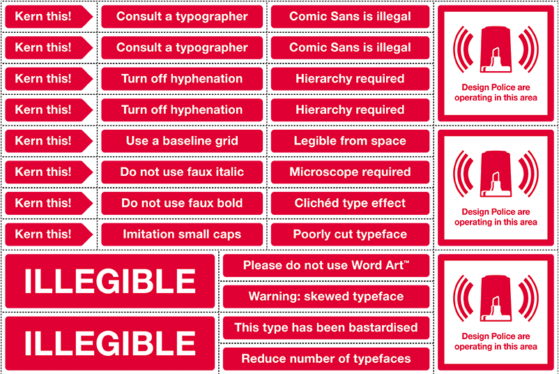
I love to read all about how badly your child stomped the competition in the spelling bee and how many stiches Bob had to get after his little fishing mishap. It’s just that I have a tough time getting past the giant Comic Sans headlines. You’re not a designer. Fine. You don’t have to be. That’s why I’m here. (Before you ask. No.)
I’ll give you some simple advice from someone who does this sort of thing for a living. This post is falling on Typography Tuesday around here, so I’ll try to restrict this to that arena. We can talk about color and layout some other time. (Something a bit more designery next week, I promise. This is important, dammit!)
Most word processing programs (Microsoft Word, etc.) have templates available for things like your holiday newsletter. Use them. They can give you a great starting point. You can still put your own flava on the piece. It will start you out in a much better place from a layout perspective.
Simple, but important guidelines regarding fonts:
- Consistency in font selection.
For something like a 2-page family newsletter. You can get away with being cute with an extra font or two for headlines. But, generally, try to stick to a maximum of three fonts for your piece. One for copy, one for headlines and perhaps another for photo captions. - Choose a point size and stick with it.
Start out with something like 11pt for paragraphs. You can always go back and change things up later to make things fill the page if need be. Of course, headlines are larger. Try to be consistent with their size as well.Also, resist the urge to make things fit an area by mucking around with different line heights (the space between the lines of text). Single spacing is great. If your particular program lets you specify a point size for line height/spacing it should be at least as high as your type. (ex: 11pt type should have a line height of at least 11pt. 13pt would be better.) - Photo captions should be set in a smaller and/or bolder font.
This provides for easy contrast against the rest of the piece and keeps it from getting lost without competing with the rest of the page. - Black is beautiful.
Color is neato, but it’s hard to read a big, red “Christmas-y” paragraph. Use color in your type judiciously. Generally black is your best bet for paragraphs of text. Larger type – like headlines – are better candidates for color. - Use bold and italics sparingly.
Save it for words you really want to emphasize. Not entire paragraphs. Even the most important thing in the newsletter doesn’t deserve to be that bold. It’s less likely to be read, in fact. - Don’t center anything.
Centered text has it’s place. You’re probably not going to visit that place in your newsletter. Trust me. - Take a cue from the pros.
Most publishers set copy in a serif font. (Garamond, Times, etc.) That’s because it’s easier to read. Take a look at any magazines you like and mimic the style a bit. You’re bound to pick up some good design decisions vicariously. There’s a reason behind almost everything professional graphic designers do. Well, almost. Desktop publishing is exceedingly easy these days. Power to the people, by all means. Wield your power responsibly. Resist the urge to use goofy fonts because they “look fun” or seem “less boring”. If you bought a horse and the kids are taking riding lessons, maybe something like Giddy-up is worth getting your hands on and making a cute headline. But please, for the love of god, don’t use Comic Sans for anything. Ever. Forget it exists.
[tags]typography, fonts, graphic design, holiday newsletter[/tags]</ol>
about mister jason™
A post-hardcore rock-n-roller, graphic designer, amateur chef, typography nerd, coffee connoisseur, radio guy, motorcyclist, skateboard commuter, and a reluctant adult. He lives in Portland Ore. USA with the lovely Dr. Adrienne and Otto T. Dog.
More like this
The Design Entrepreneur, by Steven Heller and Lita Talarico
Frank Kozik’s brightly colored toy smoking rabbit for Paul Budnitz’s Kidrobot typifies the intersection between graphic design and product design. Is it a product design, graphic design, or art?
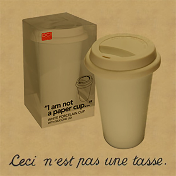
This is not a paper cup
Ceci n'est pas une tasse (de papier)