New logo for Intel. Hello 1995.
Intel’s latest logo incarnation
I’d heard rumors of a pending rebrand for Intel, but hadn’t really had time to seek out further info or sneak peeks. I was listening to the latest TWIT-cast and they mentioned the logo system. Off I went to exact my lazy and quick judgement of the culmination of surely countless hours of revisions.
First of all, it’s high time. Secondly, I’m underwhelmed. I don’t think I need to mention how striking the resemblance to the majority of dot-bomb logos that were churned out in the mid-90s. But I just did. So there. At least the hoop bit isn’t rendered in 3D with a bigass drop shadow under it. But enough with the hoops and spirals already.
This thing looks like it should be the old logo. Way to go on the nice type design. But the design overall? meh.
about mister jason™
A post-hardcore rock-n-roller, graphic designer, amateur chef, typography nerd, coffee connoisseur, radio guy, motorcyclist, skateboard commuter, and a reluctant adult. He lives in Portland Ore. USA with the lovely Dr. Adrienne and Otto T. Dog.
More like this
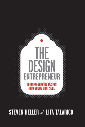
The Design Entrepreneur, by Steven Heller and Lita Talarico
Frank Kozik’s brightly colored toy smoking rabbit for Paul Budnitz’s Kidrobot typifies the intersection between graphic design and product design. Is it a product design, graphic design, or art?
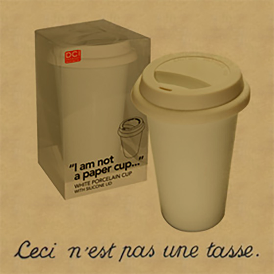
This is not a paper cup
Ceci n'est pas une tasse (de papier)