The Real Thing Gets More Real
 It’s no secret that I have an unnatural fascination with packaging design. Coke’s package design has been in constant flux for years and usually just seems noisy to me. I was struck when I picked up a can the other day and saw a flat, solid field of red behind the Coca-Cola logo. A refreshing change in itself. But look at the type the word classic is set in. Very modern without being too damned trendy.
Good job to the team responsible for this redesign. If it made it past marketing without getting fake water droplets added to the print file because someone was out sick…maybe they should go on a permanent vacation. Less is more. More less, please.
about mister jason™
A post-hardcore rock-n-roller, graphic designer, amateur chef, typography nerd, coffee connoisseur, radio guy, motorcyclist, skateboard commuter, and a reluctant adult. He lives in Portland Ore. USA with the lovely Dr. Adrienne and Otto T. Dog.
More like this
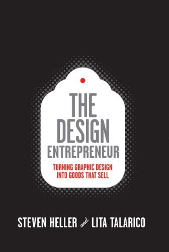
The Design Entrepreneur, by Steven Heller and Lita Talarico
Frank Kozik’s brightly colored toy smoking rabbit for Paul Budnitz’s Kidrobot typifies the intersection between graphic design and product design. Is it a product design, graphic design, or art?
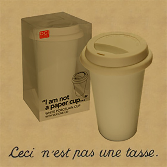
This is not a paper cup
Ceci n'est pas une tasse (de papier)