One of those things that initially seem dumb, but have turned out to be fantastically useful to have on hand.
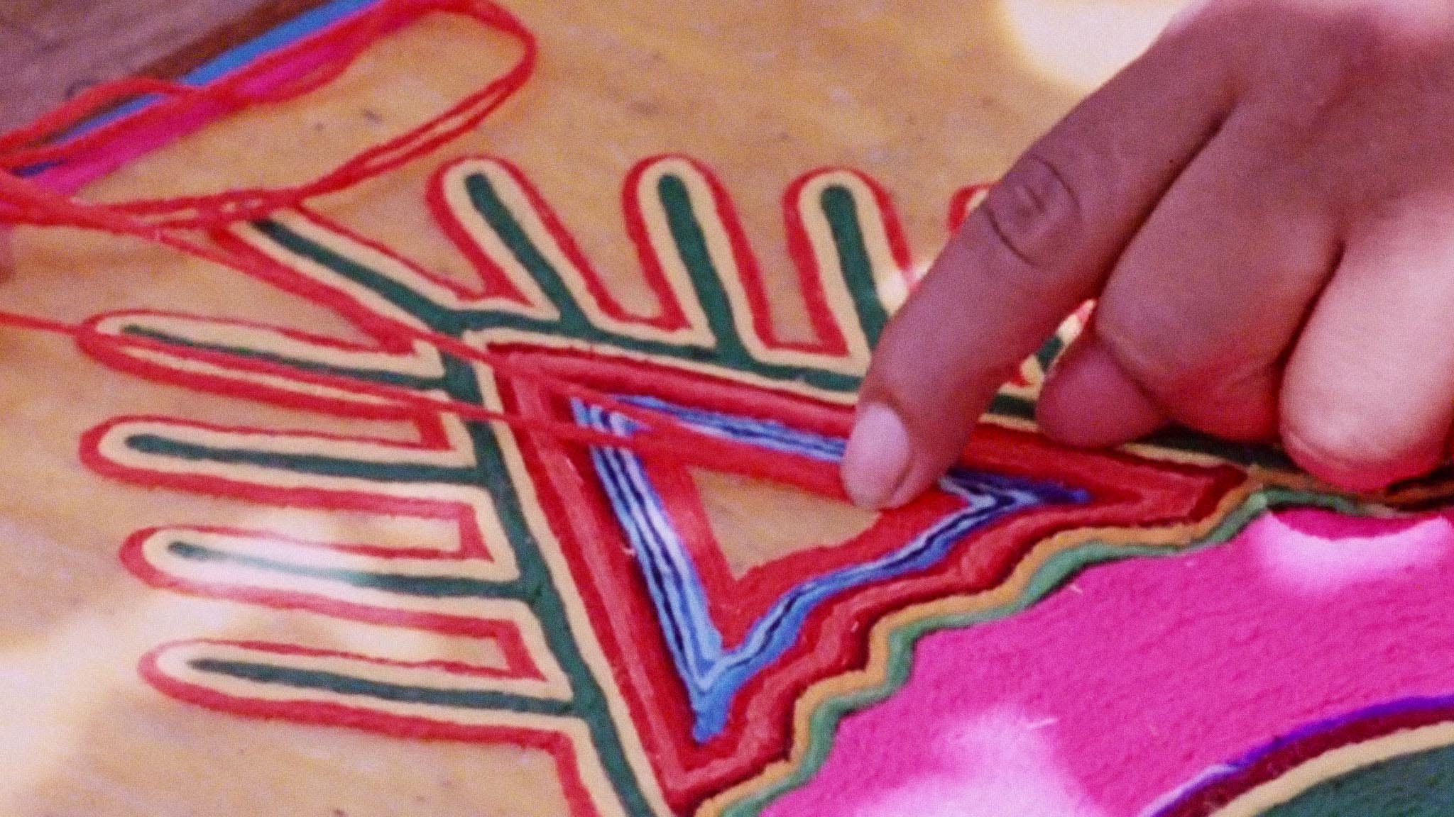
Short documentary hows the special skills of artisans working at their crafts in seven countries around the globe.
Radio and rave nostalgia with a cherry-picked volley of adverts from London pirate radio 1984-1993...
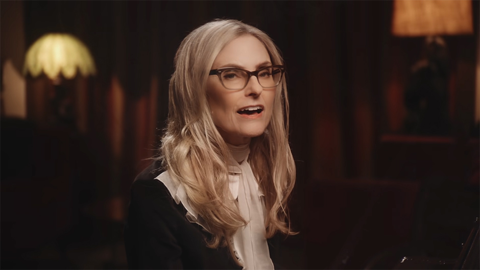
Truly one of the most remarkable careers in show business.
Aimee Mann’s latest album Queens of the Summer Hotel ... I’m an easy sell on Aimee Mann records, but this one really is exceptional.
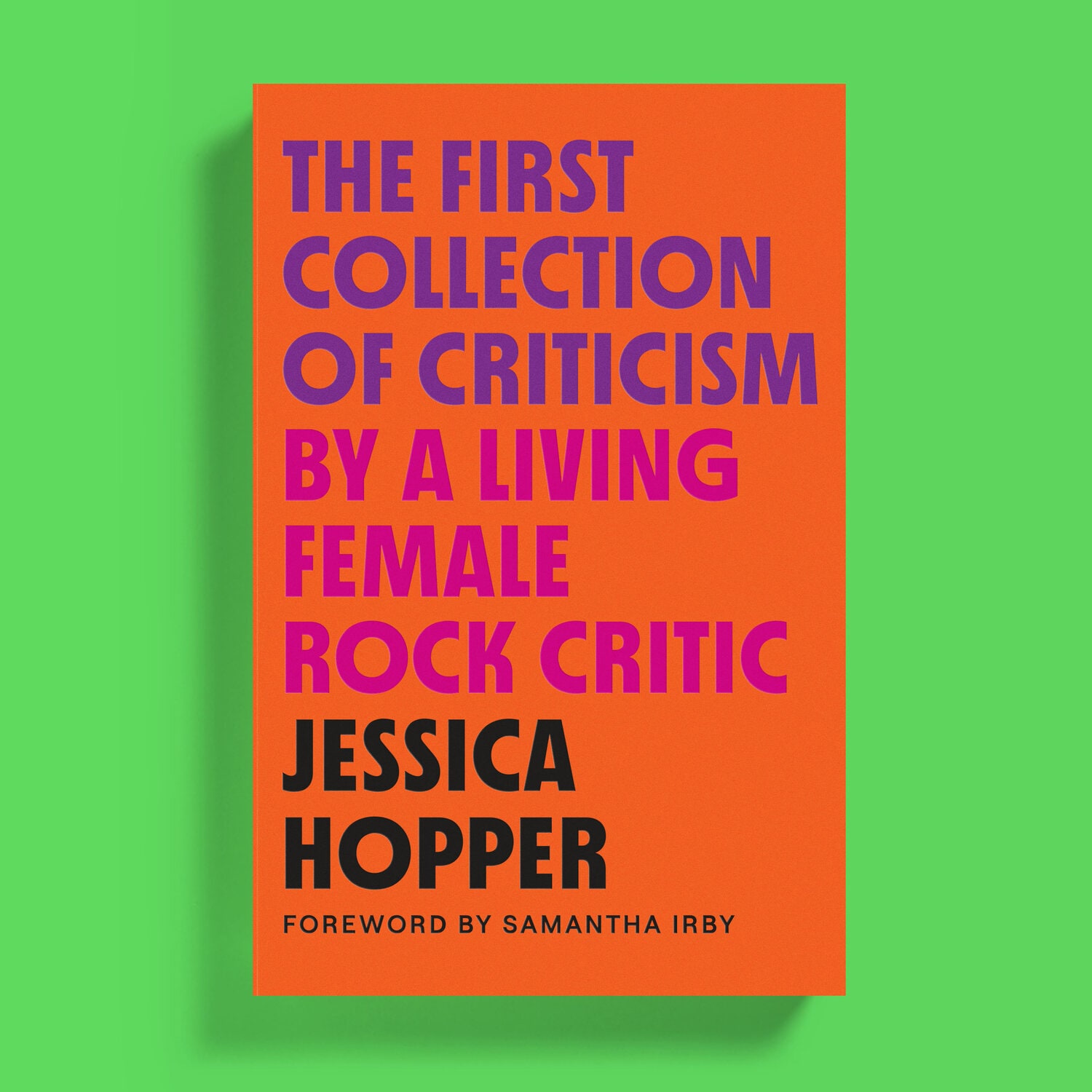
“Jessica Hopper’s criticism is a trenchant and necessary counterpoint not just on music, but on our culture at large.” —Annie Clark, St. Vincent
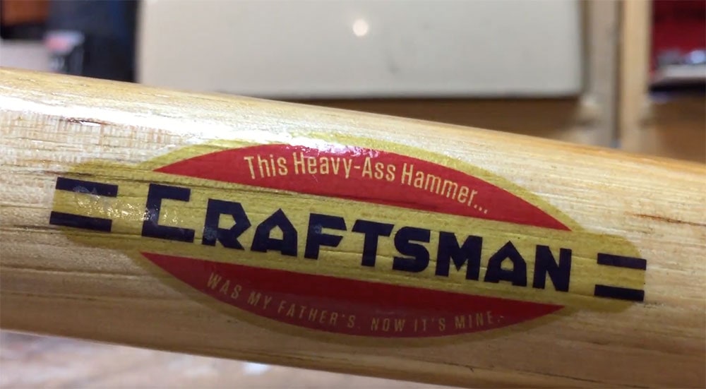
I've been hanging up more of my hand tools lately and this thing was looking tired. I gave it a new label and some refinishing so it can be a...
Instead of “I will get back to you…love, kristin” it makes me say, “I will get back baby bad balls to you…love cretin”
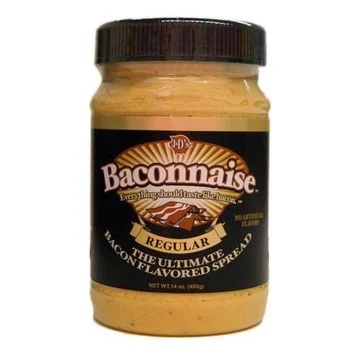
It’s a sign. (Baconnaise)
Rudy Ray Moore, master of the obscene, rhyming insult/threat died yesterday in Akron, Ohio at age 81.
Thirst for more?
Get this sort of thing delivered in a zine
of an email.